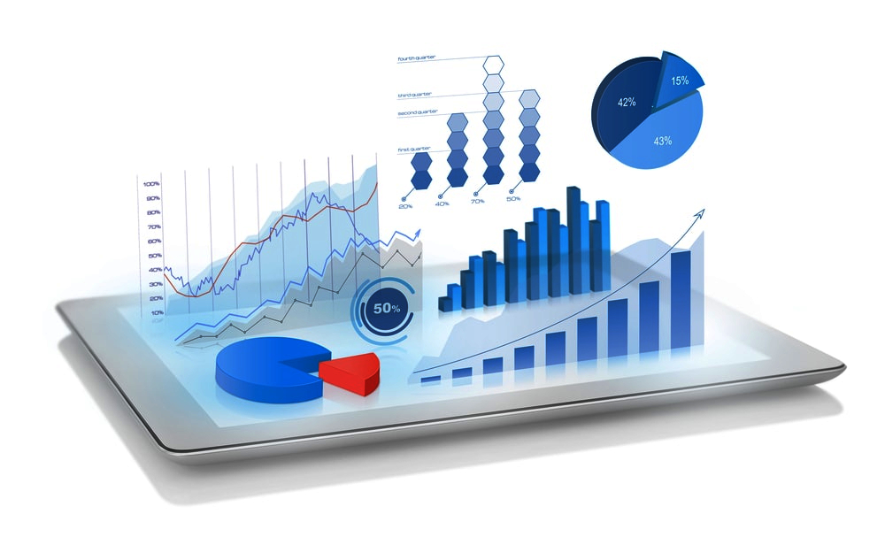
Data visualization is the presentation of data in graphical or pictorial formats to facilitate understanding, interpretation, and analysis. The goal of data visualization is to convey complex information in a visual form that is easy to comprehend, enabling viewers to identify patterns, trends, and insights more effectively than they might with raw data alone. Visualization can be applied to various types of data, including numerical, textual, and spatial information. Here are some key aspects of data visualization:
Charts and Graphs:
Common types of visualizations include bar charts, line graphs, pie charts, scatter plots, and heatmaps. Each type of chart is suitable for representing specific types of data relationships or distributions.Dashboards:
Dashboards are interactive displays that often incorporate multiple visualizations and data elements on a single screen. They provide a comprehensive overview of key metrics and trends, allowing users to monitor and analyze information efficiently.Maps and Geographic Visualizations:
Representing data in a geographical context, such as using maps to display regional variations or spatial relationships. Geographic visualizations are useful for understanding patterns based on location.Infographics:
Infographics combine visual elements, text, and graphics to present information in a visually appealing and easily digestible format. They are often used to convey a narrative or highlight key points.Treemaps and Hierarchical Visualizations:
Treemaps represent hierarchical data structures using nested rectangles to illustrate the relationships between categories. Hierarchical visualizations help users explore data in a structured and organized manner.Network Diagrams:
Visual representations of relationships between interconnected nodes or entities. Network diagrams are useful for illustrating complex systems, such as social networks or organizational structures.Word Clouds:
Graphic representations of text data, where the size of each word corresponds to its frequency or importance in the dataset. Word clouds are often used to visualize the most prominent terms in a body of text.3D Visualizations:
Representing data in three dimensions to add depth and perspective to the visualization. 3D visualizations are used in various fields, such as scientific research and design.Time Series Visualizations:
Representing data points over time, such as line charts or stacked area charts. Time series visualizations help reveal temporal patterns and trends.Interactive Visualizations:
Visualizations that allow users to interact with the data, such as zooming, filtering, or clicking on elements for more details. Interactivity enhances user engagement and exploration of the data.